|
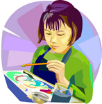
It can be a still life
(I rarely use this form but it is
very popular) or your favorite room
somewhere, something from your mind
or other subject matter to work
from. I do my painting 99% of the
time in my studio from reference
material (mostly my photos). My
photo will be my value study, color
and design study. Photoshop does
wonders for me. There are other
programs that are just as worthy.
My discussion here is from that
viewpoint.
Go through your own reference photos
(cannot use others, it is a
copyright infringement) or a place
that you can design out on paper
first. I keep a file of watercolor
worthy photos by subject to choose
from. Try different sizes of the
same subject, perhaps cropped in
some way to get the effect you are
trying to achieve. I Use this photo
to put the painting together.
Frequently I use a projector and
trace my painting onto my 300lb
paper. This old method was used by
the masters with lens and boxes!
There are other ways, this works
best for me.
How is the photograph’s design? Is
it lopsided? Too much interest on
one side? Does it flow (does your
eye move around or do you get stuck
on a spot?) Does it have a pattern?
(T, S, L or other letter) Each
painting should have some of this in
it. Make sure that the focal point
of your painting is in one of four
spots on your painting. (put two
lines, horizontally and vertically,
equally spaced on the photo you are
using. Where the lines cross should
be your focal point at one of the
crosses.
Values: Your darks and lights
should be next to each other.
Contrast adds drama to a painting.
Are your warm and cool colors in the
right place? When you have a
shadow, it should be a cooler color,
in direct light, it should be warmer
color. Using Red: Warmer reds
should have some yellow. Cooler
reds should have some blue. Using
Yellow: Warmer yellows should have
some red. Cooler yellows should
have more blue. I have discovered
that I have not found any true
Blues, Yellows or Reds.
I always try to follow these
“rules” But I have also found that
breaking a rule is fun. Sometimes
it could create a really effective
painting. I have also found that
someone may not agree with this
process. I have learned that there
are so many opinions out there that
finding your own is important.
The most important rule: Make time
to do your art!
Terry
Arroyo Mulrooney
Watercolorist
www.TerryMulrooneyStudios.com
|